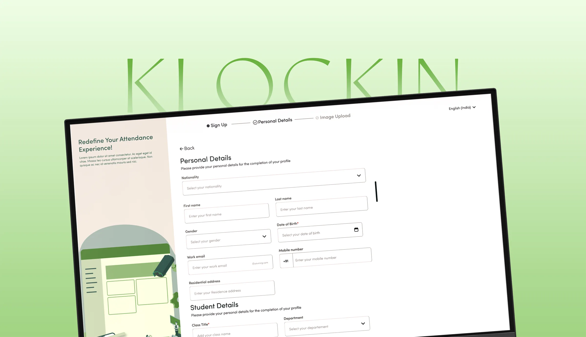
Klockin is a facial-recognition attendance system I designed at Metafusion. Using existing video analytics tech, originally built for surveillance and ANPR, to solve attendance tracking for institutions and enterprises using CCTV already in place, no new hardware required.

PROJECT OVERVIEW
Klockin is a facial-recognition-based attendance system I designed at Metafusion, where I was the Founding Product and Visual Designer. It uses Metafusion's existing video analytics and facial recognition technology, originally built for surveillance and ANPR, to solve attendance tracking for educational institutions and enterprises, without any new hardware installation.
I identified the opportunity independently, built out the full product vision (case studies, wireframes, and role architecture) and pitched it directly to the founders. It went on to close 5 clients, including IKEA, BITS Institute, and Smartwork, before development had even begun. I then led the 2-week sprint to deliver a shippable MVP with a team of 3 under me, handing off complete documentation to engineering. The product launched under the name Klockin and shipped within a month of handoff.
Problem
At my own college, attendance was taken by hand in classes of 100+ students, eating 10–20 minutes of lecture time and leaving room for proxy check-ins. In India, falling below the attendance threshold disqualifies a student from sitting final exams, so this wasn't a minor annoyance. Existing fixes like fingerprint or dedicated face-capture hardware needed installation in every room, still created bottlenecks, and for enterprises, attendance errors fed straight into payroll and performance data. The opening: institutions already have CCTV everywhere. No new hardware needed.
Mission
Make attendance invisible: no queues, no manual roll call, no proxy check-ins, no new hardware. Just accurate data running quietly in the background. And because that data decided exam eligibility and fed payroll and performance reviews, the mission also meant earning trust in it, ensuring the right people could see and control the right data at every level.
Solution
Instead of tracking everyone continuously, which breaks down in a 400-student hall, Klockin recognizes faces at entry and exit points, calculating attendance as cumulative time against a set threshold rather than a single check-in. Every edge case, students stepping out and back in, overlapping sessions, mid-session faculty changes, was mapped and solved before any screens were designed. I also built a 5-tier role hierarchy (Standard User, Moderator, Admin, Super Admin, internal override) to keep sensitive data scoped to the right people, with data stored locally and synced when connectivity allowed. The MVP that shipped scoped this to End User and Admin roles, delivered in a 2-week sprint, with the rest phased in as real usage data came in.

USER RESEARCH
Attendance friction showed up differently depending on where you sat in the system, so research focused on four groups directly affected by it, from the person marking present to the person relying on that data months later for payroll or academic eligibility.
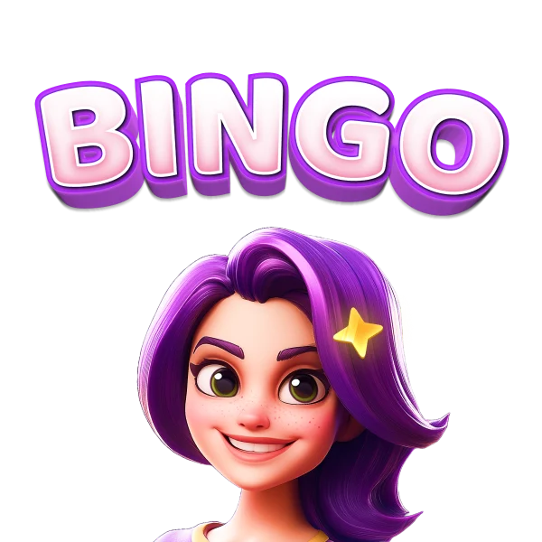
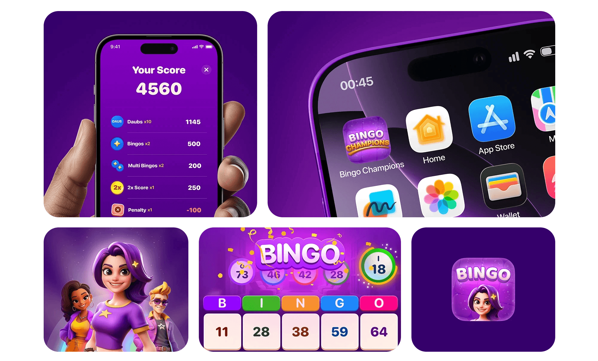
Wordmark for App Icon with Avatar
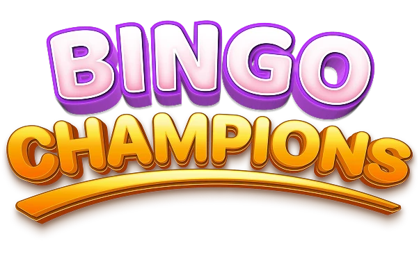
Main Logo
COLOR PALETTE
The logo can be used in different variations basis on where the logo is being placed. The main Logo mark represents the true brand & should be used on areas of branding.The other variations of logo can be created for App icon or graphics to evoke bold, playful, and authentic sense.
HEX: #F12EE4
RGB: (241, 46, 228)
CMYK: 0%, 81%, 5%, 5%
Primary Color
HEX: #FFC300
RGB: (255, 195, 0)
CMYK: 0%, 24%, 100%, 0%
Primary Color
HEX: #6B00C7
RGB: (107, 0, 199)
CMYK: 46%, 100%, 0%, 22%
Primary Color
TYPOGRAPHY
SF Pro Rounded was selected to support Bingo Champions' friendly, approachable, and modern visual identity. Its rounded letterforms bring warmth and playfulness to the interface while maintaining exceptional readability across gameplay, rewards, and promotional content. Designed to appeal to a broad audience, including the game's core demographic of middle-aged women in the U.S., the typeface creates a welcoming experience without compromising clarity. Its versatile range of weights (Medium, Semibold, Bold, and Black) establishes a strong visual hierarchy, ensuring information remains easy to scan across different screen sizes and interaction points while reinforcing the brand's fun yet trustworthy personality.
Medium
Semi-Bold
Bold
Black
Aa
Bb
Cc
Dd
Ee
Ff
Gg
Hh
Ii
Jj
Kk
Ll
Mm
Nn
Oo
Pp
Rr
Ss
Tt
Uu
Vv
Ww
Xx
Yy
Zz
0123456789!@#$%^&*()_+[]\,./{}:<>?
0123456789!@#$%^&*()_+[]\,./{}:<>?
Bingo
CHARACTER SYSTEM
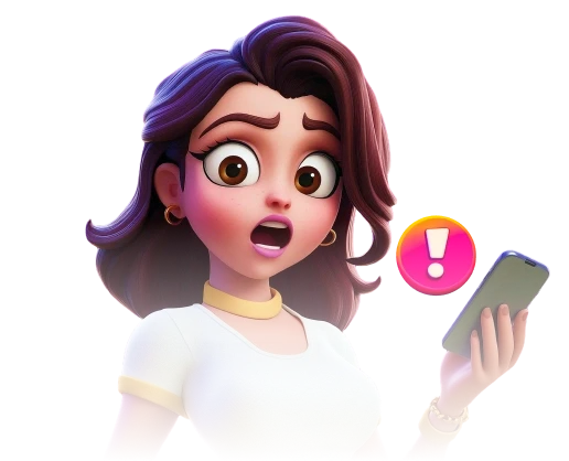
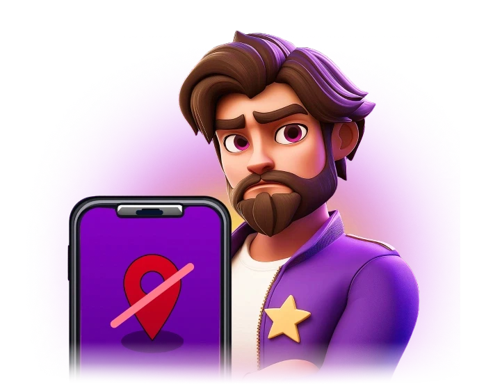
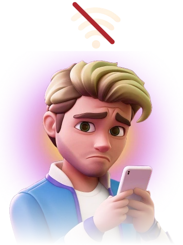
To extend the brand beyond the interface, we developed a diverse cast of stylized 3D characters that brought personality and storytelling into the Bingo Champions experience. Each character was designed with a distinct appearance, expression, and visual identity while following a consistent art direction to ensure cohesion across the product.
The character system was used throughout gameplay, marketing campaigns, social media, tutorials, promotional events, and seasonal content, creating a more engaging and memorable brand experience.

Character Style
The characters follow a stylized 3D illustration style that combines expressive facial features, soft proportions, and premium rendering. Rounded forms, vibrant colors, and detailed lighting create a friendly, approachable look that complements the playful nature of the game while maintaining a polished, modern aesthetic.
This variety made the world of Bingo Champions feel more inclusive and relatable while giving the brand a richer visual identity.
Design Principle
Stylized 3D
Semi-Realistic
Rounded Forms
Bold Silhouettes
Expressive Faces
Dynamic Poses
Vibrant Colors
Soft Lighting
Rich Materials
Clean Detailing
UI ASSETS
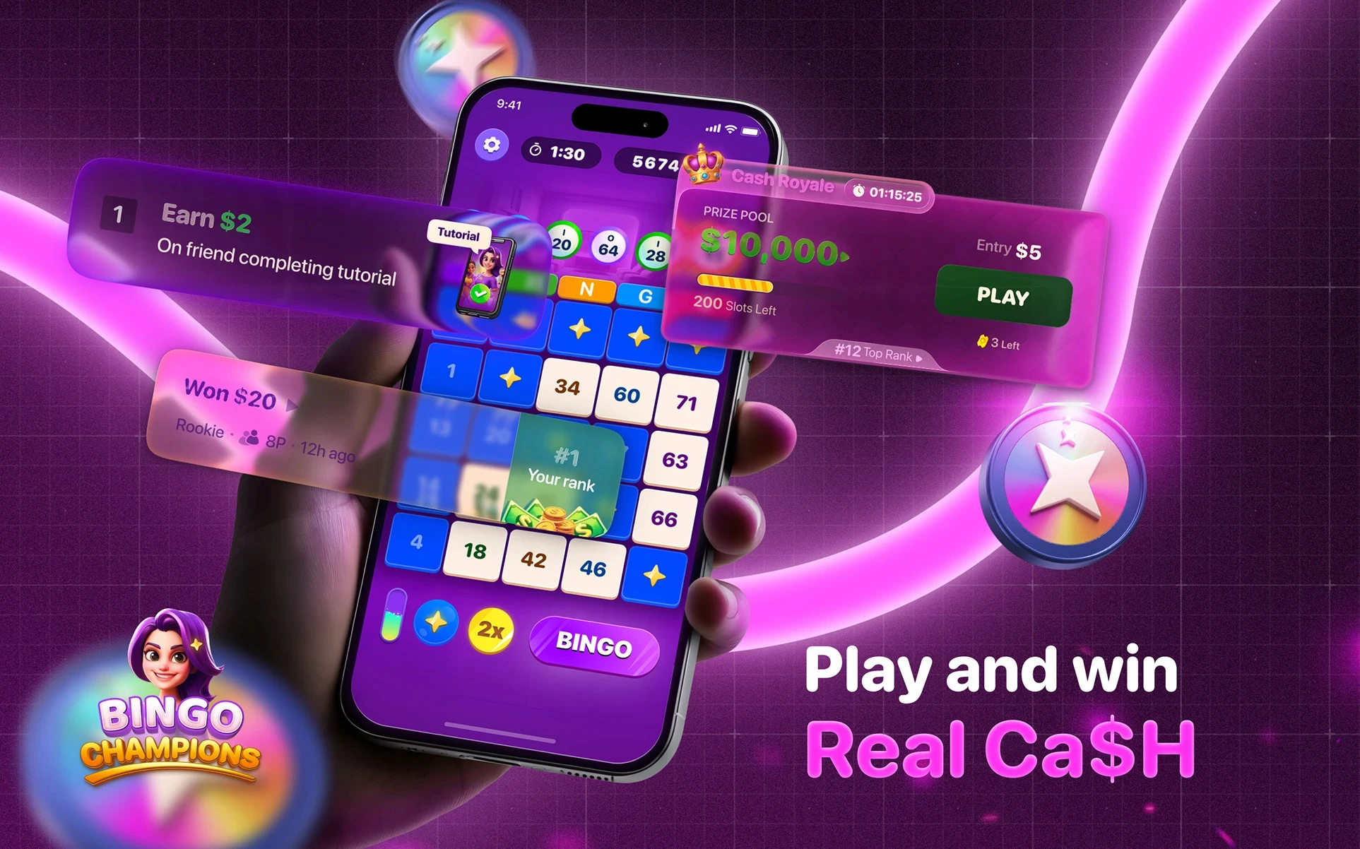
Created a cohesive library of UI assets to establish consistency across the product. Every component was designed to reinforce the brand's playful personality while ensuring clarity and scalability as new game modes, rewards, and events were introduced.


























MOTION DESIGN
Motion was an integral part of the Bingo Champions experience. From gameplay feedback to reward celebrations, I designed animations that enhanced usability, guided player attention, and brought the brand's playful personality to life.
For more UGC videos of asset related animation, feel free to reach out ot me.