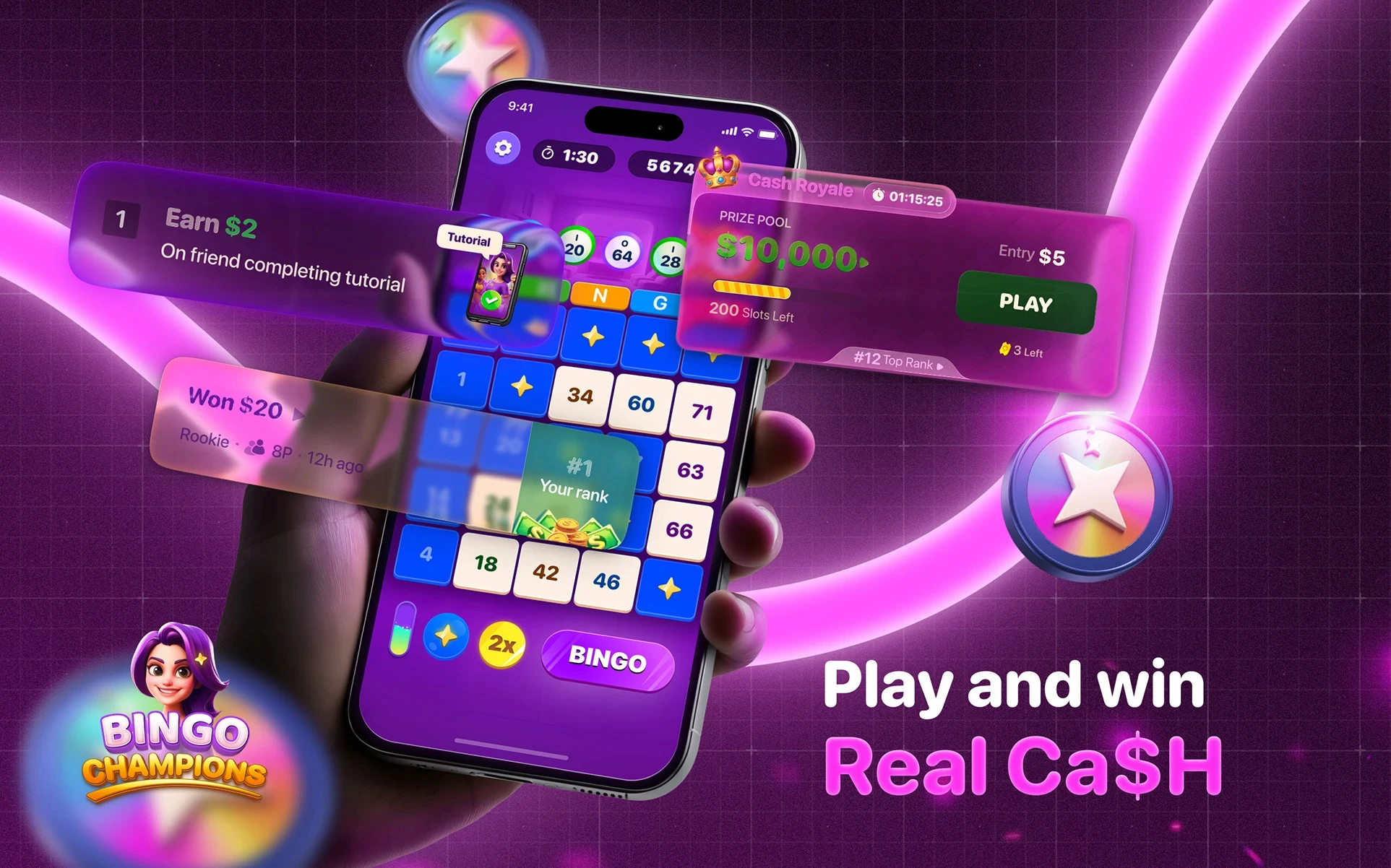
A modern take on classic bingo, designed with a vibrant brand identity, polished UI, and motion-rich gameplay to create an engaging player experience.
PROJECT OVERVIEW
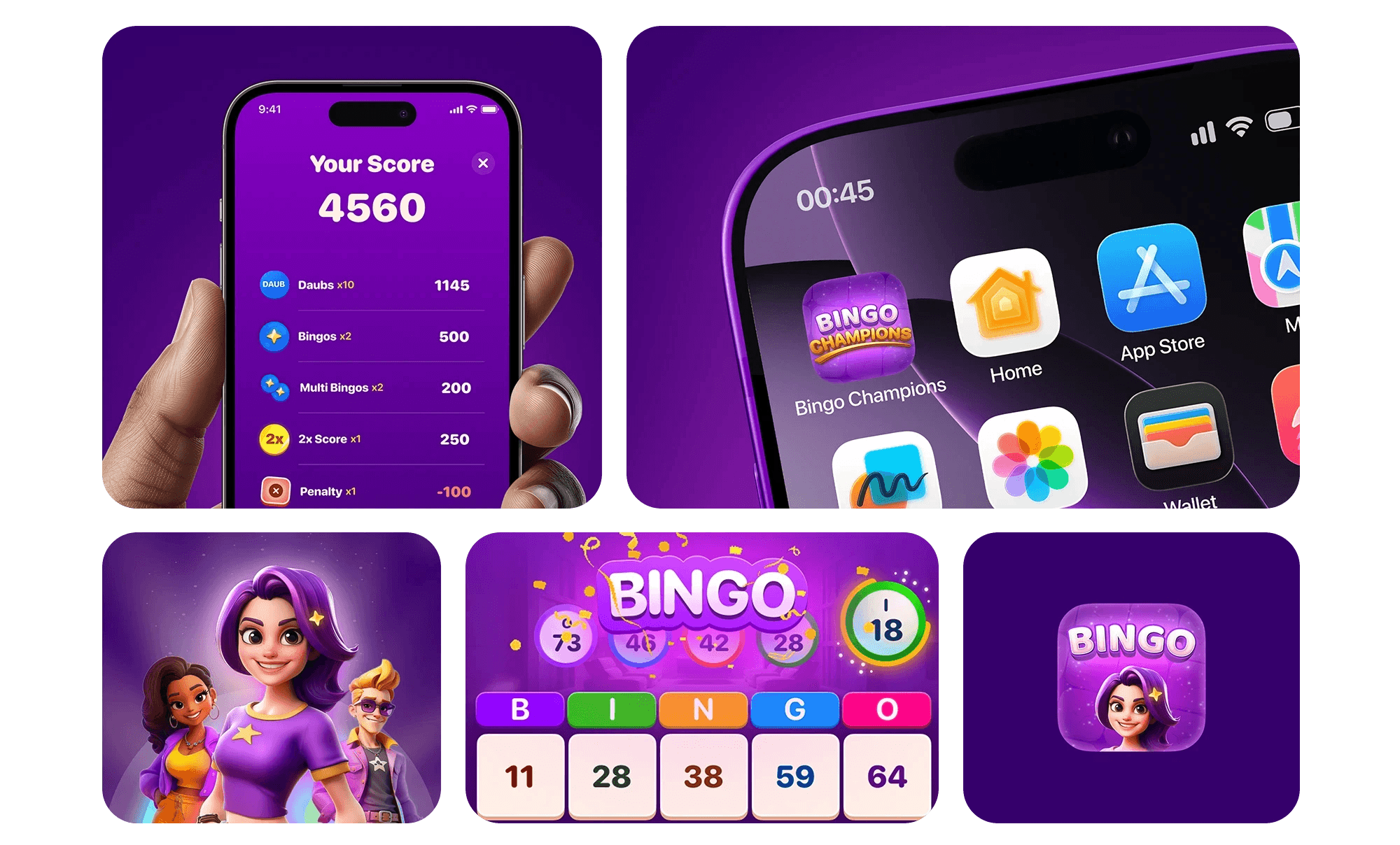
Bingo Champions is a real-money mobile bingo game designed to modernize a classic game through a fast, rewarding, and visually engaging experience. My role as the Motion + Visual Designer was to establish a distinctive visual identity and translate it into a cohesive product experience spanning branding, in-game UI, motion design, and marketing creatives.
The project involved creating a scalable design system that unified every player touchpoint from app store presence and onboarding to gameplay, animations, social media, and promotional campaigns. The goal was to make Bingo Champions feel energetic, approachable, and premium while differentiating it from the dated visual language common in the bingo category.
About Bingo Champions
Bingo Champions is a competitive mobile bingo experience that combines the familiarity of classic bingo with modern game mechanics, interactive features, and real-money competition where supported.
The experience focuses on fast-paced gameplay, rewarding progression, and engaging interactions. Through modern UI design, thoughtful motion, custom iconography, and animated gameplay elements, the product transforms a traditionally static game into a vibrant and contemporary mobile experience.
Challenge Statement
The mobile bingo market is dominated by products with outdated interfaces, inconsistent branding, and repetitive visual styles. Many existing apps rely on similar color palettes, generic iconography, cluttered layouts, and minimal interaction design, resulting in experiences that feel visually stale and difficult to navigate.
Bingo Champions needed a design language that could redefine these expectations by creating an experience that was:
Distinctive enough to stand out in crowded app stores and advertising platforms.
Modern and approachable, appealing to both casual players and long-time bingo enthusiasts.
Visually consistent across branding, gameplay, and marketing.
Engaging, using thoughtful motion and interaction design to make gameplay feel rewarding.
Scalable, allowing new features, promotions, and seasonal campaigns to be introduced without compromising brand consistency.
LOGO VARIATIONS
The logo can be used in different variations basis on where the logo is being placed. The main Logo mark represents the true brand & should be used on areas of branding.
The other variations of logo can be created for App icon or graphics to evoke bold, playful, and authentic sense.
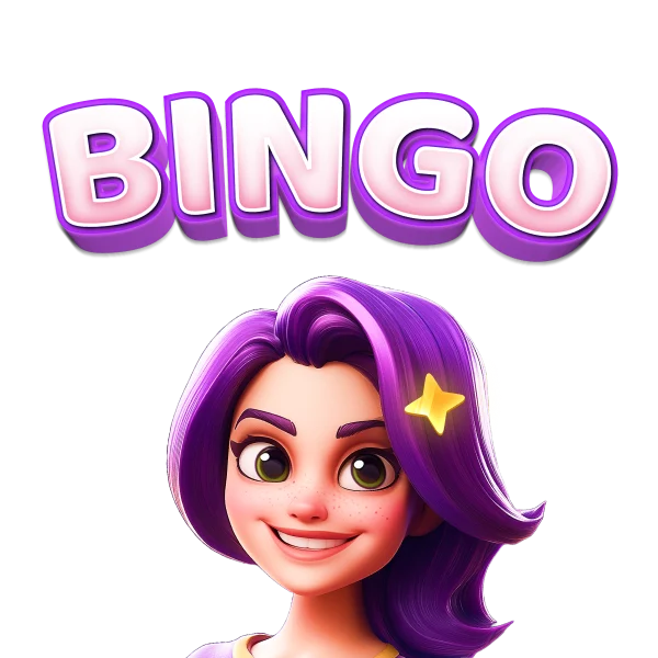
Wordmark for App Icon with Avatar
Main Logo
COLOR PALETTE
The logo can be used in different variations basis on where the logo is being placed. The main Logo mark represents the true brand & should be used on areas of branding.The other variations of logo can be created for App icon or graphics to evoke bold, playful, and authentic sense.
HEX: #F12EE4
RGB: (241, 46, 228)
CMYK: 0%, 81%, 5%, 5%
Primary Color
HEX: #FFC300
RGB: (255, 195, 0)
CMYK: 0%, 24%, 100%, 0%
Primary Color
HEX: #6B00C7
RGB: (107, 0, 199)
CMYK: 46%, 100%, 0%, 22%
Primary Color
TYPOGRAPHY
SF Pro Rounded was selected to support Bingo Champions' friendly, approachable, and modern visual identity. Its rounded letterforms bring warmth and playfulness to the interface while maintaining exceptional readability across gameplay, rewards, and promotional content. Designed to appeal to a broad audience, including the game's core demographic of middle-aged women in the U.S., the typeface creates a welcoming experience without compromising clarity. Its versatile range of weights (Medium, Semibold, Bold, and Black) establishes a strong visual hierarchy, ensuring information remains easy to scan across different screen sizes and interaction points while reinforcing the brand's fun yet trustworthy personality.
Medium
Semi-Bold
Bold
Black
Aa
Bb
Cc
Dd
Ee
Ff
Gg
Hh
Ii
Jj
Kk
Ll
Mm
Nn
Oo
Pp
Rr
Ss
Tt
Uu
Vv
Ww
Xx
Yy
Zz
0123456789!@#$%^&*()_+[]\,./{}:<>?
0123456789!@#$%^&*()_+[]\,./{}:<>?
Bingo
CHARACTER SYSTEM
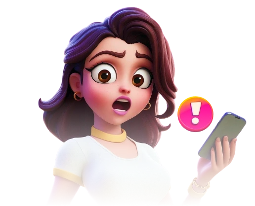
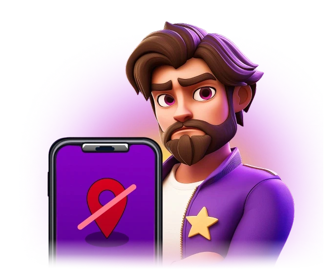
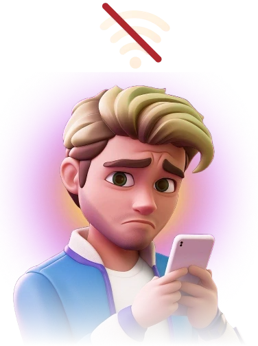
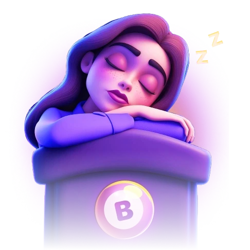
To extend the brand beyond the interface, we developed a diverse cast of stylized 3D characters that brought personality and storytelling into the Bingo Champions experience. Each character was designed with a distinct appearance, expression, and visual identity while following a consistent art direction to ensure cohesion across the product.
The character system was used throughout gameplay, marketing campaigns, social media, tutorials, promotional events, and seasonal content, creating a more engaging and memorable brand experience.

Character Style
The characters follow a stylized 3D illustration style that combines expressive facial features, soft proportions, and premium rendering. Rounded forms, vibrant colors, and detailed lighting create a friendly, approachable look that complements the playful nature of the game while maintaining a polished, modern aesthetic.
This variety made the world of Bingo Champions feel more inclusive and relatable while giving the brand a richer visual identity.
Design Principle
Stylized 3D
Semi-Realistic
Rounded Forms
Bold Silhouettes
Expressive Faces
Dynamic Poses
Vibrant Colors
Soft Lighting
Rich Materials
Clean Detailing
UI ASSETS
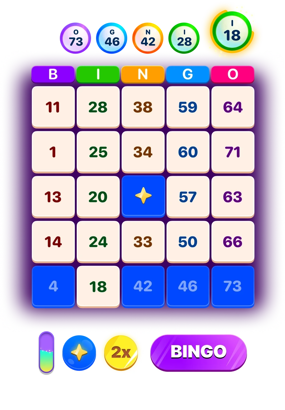
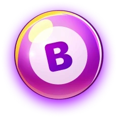
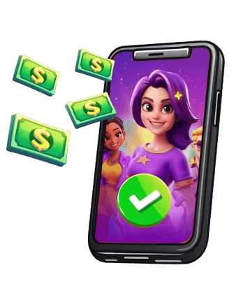
Created a cohesive library of UI assets to establish consistency across the product. Every component was designed to reinforce the brand's playful personality while ensuring clarity and scalability as new game modes, rewards, and events were introduced.























MOTION DESIGN
Motion was an integral part of the Bingo Champions experience. From gameplay feedback to reward celebrations, I designed animations that enhanced usability, guided player attention, and brought the brand's playful personality to life.
For more UGC videos of asset related animation, feel free to reach out ot me.